
Manchester United have just released their official third shirt for the 2020-21 season, and it sure looks like a humdinger of a design that’s bound to bring on the tribal war drums of discordance among the austere establishment’s faithful hordes.
Just like last season’s alternative shirt was appallingly greeted with negative response by the United fanbase, with the sand-coloured mosaic textural effect failing to resonate and capture the imagination of many, United’s latest attempts at creativity seems most likely to be headed for a similar fate.
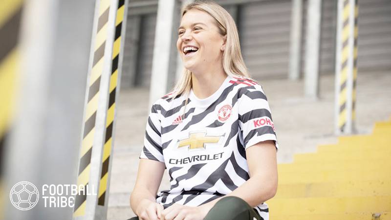
To say that the new white jersey adds a new spin on the zebra-motif is definitely an understatement, to say the least. For one, the black stripes blazing diagonally across the shirt, with a few right-angles thrown in haphazardly, although supposedly serving as creative counterpoints, look horrendously cumbersome and garish to the point of being uncouth, vulgar even.
Then again, the stripes come in an odd assortment of shapes and sizes all the way across the shirt, creating a totally disharmonious effect and look which, ironically, manufacturer Adidas purportedly claims to help create a “disruptive” look. “Disruptive” is certainly the right word to describe the overall effect created as in being totally devoid of balance and harmony.
Obviously the loud-looking design must have been meshed out to target the younger fans, and could take a while, like a few decades perhaps, to win over the older echelon of United’s diehards.
Thankfully, Adidas has confidently intoned that the shirt will be worn in accompaniment with plain white shorts, which in this case would appear to be a wise move given the negative publicity and furore that followed a recent leaked marketing image showing the striped effect running across the entire strip.
And should there be fans actually enamored of the new zebra kit, hoping to go full ‘psychedelic zebra’– shirts, shorts and socks will be available for purchase.
Adidas says the loud design is actually the creative result of an intended homage to United’s history of striped kits, which began over 100 years ago and also featured on strips in the 1970s and 80s. In a supposed affirmative nod to that past, the latest release even includes a “110 years of stripes” tagline on the collar.
Now we’ve seen it all, the Freudian nightmare of a ‘zebra’ kit for the 2020-21 season.
Let’s raise a toast to horrendously bad taste!
Credit: Football Tribe Malaysia


